MAPPA Changed Everything About Jujutsu Kaisen's Art
Season 2 threw out the rulebook and people are still arguing about it
If you watched Jujutsu Kaisen Season 1 and then jumped straight into Season 2 without warning, you'd think someone swapped the Blu-rays. The first season hit screens with that glossy, overproduced look. Heavy shadows. Thick lines. Colors so saturated they looked wet. Then Season 2 dropped and suddenly everyone's faces got thinner, the lines got scratchier, and the whole thing started looking like someone photocopied Gege Akutami's rough drafts straight onto your TV. That's not an accident. MAPPA made a choice, and it broke the fanbase in half.
People expected Season 1 part two. What they got was something closer to a high-budget indie film that happens to have cursed spirits in it. The Jujutsu Kaisen anime didn't just continue. It mutated. Some fans call it degraded. Others call it genius. The truth sits somewhere in the middle, but you can't talk about modern shonen animation without dealing with this split.
Season 1 vs Season 2: Two Different Animals
Season 1 looked expensive. Every frame had detail packed into corners that didn't need it. When Gojo pulled off his eye reveal or when Sukuna did his thing in the first episode, it had that Ufotable-adjacent sheen. Clean. Digital. Almost too perfect. The domain expansions looked like abstract art installations with all that heavy shading and particle effects.
Then Season 2 started with the Hidden Inventory arc and everything changed. The lines got simpler. Brighter colors washed over the screen. Summer vibes everywhere. But it wasn't just a palette swap. The character designs shifted hard. Yuji looked like he lost ten pounds in his face. Megumi's hair exploded in volume. Gojo's features got sharper, more angular. Reddit threads exploded with complaints about the art style looking "degraded" or comparing it to Pokemon animation errors. But here's the thing: that sketchy, loose look wasn't laziness. It was intentional direction meant to mirror Akutami's manga style more closely.
The rough lines and action scribbles serve the fights. When Gojo fought Toji in Episode 3, that 9.7 IMDB rating didn't come from perfect proportions. It came from movement. The simplified style let the animators go wild with smears, impact frames, and choreography that would have been impossible under Season 1's rigid detail requirements. You can see the difference clear as day when you compare the Purple technique animation from Season 1 to the Blue technique in Season 2's third episode. One looks like a cutscene from a AAA game. The other looks like a living sketch that might tear through the screen.
How It Stacks Against the Big Dogs
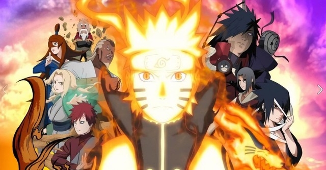
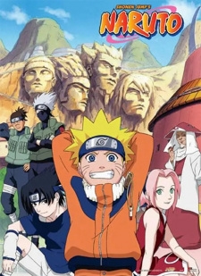
People always want to know how JJK compares to the holy trinity of shonen. You know the ones. Naruto. Bleach. The old guard that defined what "anime fighting" meant for decades.
Jujutsu Kaisen steals from all of them but wears the clothes differently. The power system, Cursed Energy, operates on negative emotions. That's way more interesting than chakra, which basically worked like magic stamina with elemental flavors. Naruto's system got bloated with tailed beasts and eye powers until it became a laser light show. JJK keeps it psychological. Your power comes from how messed up you are inside. That's way closer to Nen from Hunter x Hunter than chakra, but with a horror twist.
Speaking of Bleach, the comparisons get thrown around because both have stylish guys in black uniforms fighting monsters. But where Bleach leaned into sword fights and bankai transformations that looked like power-up sequences, JJK goes for domain expansion. Those guaranteed-hit environments look like surrealist paintings. When Gojo opens Unlimited Void, it doesn't look like Ichigo going Bankai. It looks like reality broke and someone spilled ink across the sky. The animation priorities are different too. Bleach had consistency. Even at its worst, it looked like Bleach. JJK swings between movie-quality sakuga and rough sketches depending on which animator drew the cut.
The Demon Slayer Problem
You can't talk about JJK animation without someone bringing up Demon Slayer. Ufotable broke the industry with that watercolor, 3D-enhanced, perfectly smooth look. Every episode looks like a movie. Tanjiro's water breathing techniques flow like liquid glass. It's beautiful. It's also sterile sometimes.
JJK doesn't try to beat Ufotable at their own game. MAPPA went the other direction. Instead of perfect digital paint, they chose grit. When Yuji fights Mahito in the sewers, it looks gross. The backgrounds get messy. The character models deform during fast motion. It has energy that Demon Slayer sometimes lacks because Ufotable polishes away the rough edges. That's not a knock on either studio. They're just playing different sports. Demon Slayer wants to be a museum piece. JJK wants to feel like a bar fight.
The Cursed Energy effects also differ from the elemental styles you see in other shonen. Naruto had fireballs and lightning spears. Bleach had Getsuga Tenshos. JJK has these distorted, glitchy visual effects that look like corrupted video files. When Mahito uses Idle Transfiguration, the animation gets wobbly and surreal. It doesn't look like any other shonen power system because it shouldn't. The horror elements demand a different visual language.
Why Season 2 Looks "Worse" But Moves Better
The backlash against Season 2's art style came from people who wanted consistency. They wanted Season 1's thick outlines and detailed faces back. But that style chokes during fast action. Look at the Domain Expansion sequences in Season 1. They look incredible but they're short. The complex shading takes too long to animate for extended sequences.
Season 2 stripped away the fat. The character designs got simpler so they could move more. When Toji Fushiguro spins that spear around, you can feel the weight because the animation isn't hiding behind heavy shadows and texture work. It's just pure motion. The trade-off means still frames look rougher. Screenshots from Season 2 circulate online looking like off-model fan art. But in motion? It sings.
This approach aligns closer to what you see in Mob Psycho 100 or even One Punch Man Season 1. Simplify the base model so the extreme poses don't look broken. JJK Season 2 takes that philosophy but applies it to a darker, more violent story. The result is fights that feel brutal instead of pretty. When Sukuna fights Mahoraga, it looks like a disaster. Buildings crumble. Blood flies in thick black lines. It doesn't look like a dance. It looks like a car crash.
The Shibuya Incident: Peak or Mess?
The Shibuya arc represents everything divisive about JJK's approach. Some episodes look like they had three months of production time. Others look like they had three weeks. That's the MAPPA schedule showing through. But when it hits, it really hits.
The Gojo vs Toji fight already got mentioned, but the Mahito vs Yuji and Todo fight also showcases the Season 2 style at its best. The distorted reality effects when Mahito uses his domain. The way the camera spins around during Black Flash impacts. It uses 3D backgrounds with 2D characters in ways that would look cheap in other shows but work here because the art style is already sketchy and loose.
Compare that to the consistency you got in long-running shonen like the original Naruto run. That show had 220 episodes and while it had plenty of off-model moments, the baseline stayed recognizable. JJK switches styles between cuts sometimes. One moment Gojo has detailed eyes. The next he's a stick figure with sunglasses. For some viewers, that's unacceptable. For others, that's the price of high-impact animation.
Character Animation and Personality
One thing JJK gets right that other shonen sleep on is how character animation sells personality. Naruto moved like a knucklehead. You could tell it was him from the silhouette and the way he bounced around. JJK does this too but with more subtlety.
Megumi moves stiff and efficient. His hands do the quick signs for shadows and he stands still while his shikigami do the work. It fits his personality. Nobara walks with swagger. Her movements are sharp and deliberate. Gojo moves like he's not touching the ground. The animation team uses different frame rates for different characters sometimes. Gojo gets more in-between frames when he's being casual because he's supposed to feel untouchable and smooth.
This attention to character-specific motion puts it above My Hero Academia sometimes, where everyone moves like action figures once the fighting starts. Deku's shoot style looks cool but it doesn't tell you much about who he is. JJK uses the animation to reinforce who these people are. Geto moves like a priest. Toji moves like a beast. The way they draw Yuji's face changing between seasons even tells a story. He looks harder in Season 2. Thinner. More worn down.
The Horror Aesthetic
Most shonen anime borrow from shonen manga aesthetics. Bright colors. Clean lines. Even when the story gets dark, the art stays accessible. JJK brings horror movie techniques into the mix.
The cursed spirits don't look like standard anime villains. They look like Junji Ito drawings that learned how to move. Mahito's Idle Transfiguration victims contort in ways that make you uncomfortable. The fingers look disgusting. The domains use negative space and impossible geometry that recalls Evangelion's angel attacks but dirtier.
This horror influence means JJK can get away with ugliness in a way other shonen can't. When Naruto went to dark places, it still looked like Naruto. When JJK gets dark, the art style shifts to match. The screen gets darker. The lines get scratchier. It visually communicates that things have gone wrong.
Where It Goes From Here
The Culling Game arc, if it gets animated, will need a different approach again. The fights get more complex. More characters. More domain expansions happening simultaneously. If MAPPA tries to animate that with the same detail level as Season 1, it will take ten years. If they use the Season 2 sketch style, they can probably manage it, but fans will keep complaining about "quality drops."
The real question is whether this split approach becomes the standard for modern shonen. Movies get the budget for consistent high detail. TV shows get the loose, high-energy style. That divide already exists but JJK made it obvious. You can't have Demon Slayer's consistency with JJK's schedule. Something has to give.
For viewers coming from the old days of shonen, this looks like a downgrade. They remember when Bleach had good animation for 50 episodes straight or when Naruto saved budget for big moments. Modern anime doesn't have that luxury. The seasonal format means every arc needs to feel like an event. So the animation gets front-loaded into specific episodes while others limp along.
Jujutsu Kaisen sits at the center of this industry shift. It looks different from its peers. It takes risks with its art direction that My Hero Academia or Black Clover wouldn't dare. Whether those risks pay off depends on whether you value consistency or peaks. The anime looks messy sometimes. The story is messy. The characters are messy. Maybe that's the point.
Final Thoughts on the Comparison Game
At the end of the day, asking whether JJK looks better than Naruto or Bleach or Demon Slayer misses the point. It's asking which tool is better without considering the job. JJK uses animation as a weapon. It wants to disorient you. It wants to shock you. The art style serves the cursed energy system, which is chaotic and dangerous.
Naruto used animation to sell ninja fantasy. Clean hand signs. Cool poses. Tactical fighting. Bleach used it to sell style. Cool coats. Dramatic sword swings. Atmospheric dread. JJK sells body horror and existential dread through shaky lines and distorted faces.
If you want something that looks safe and polished, watch Demon Slayer. If you want something that looks like it might hurt you, watch JJK Season 2. The Jujutsu Kaisen anime chose a path that alienated some fans but created something distinct in a genre full of copies. That counts for something, even if the screenshots look weird.